When Information Starts to Move.
Financial data, interactive concepts and motion experiments that bridge information design and digital experience.
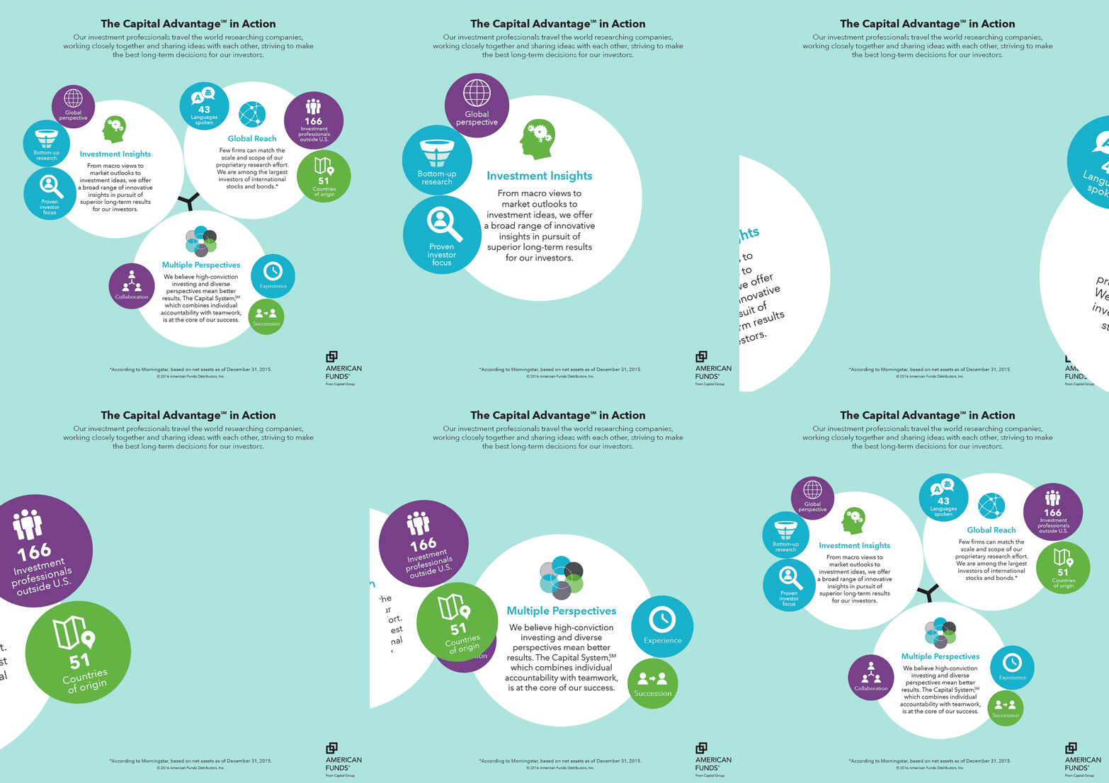
At Capital Group, the challenge was not merely making financial information attractive. The work had to remain accurate, brand-consistent and usable inside a tightly controlled financial-services environment.
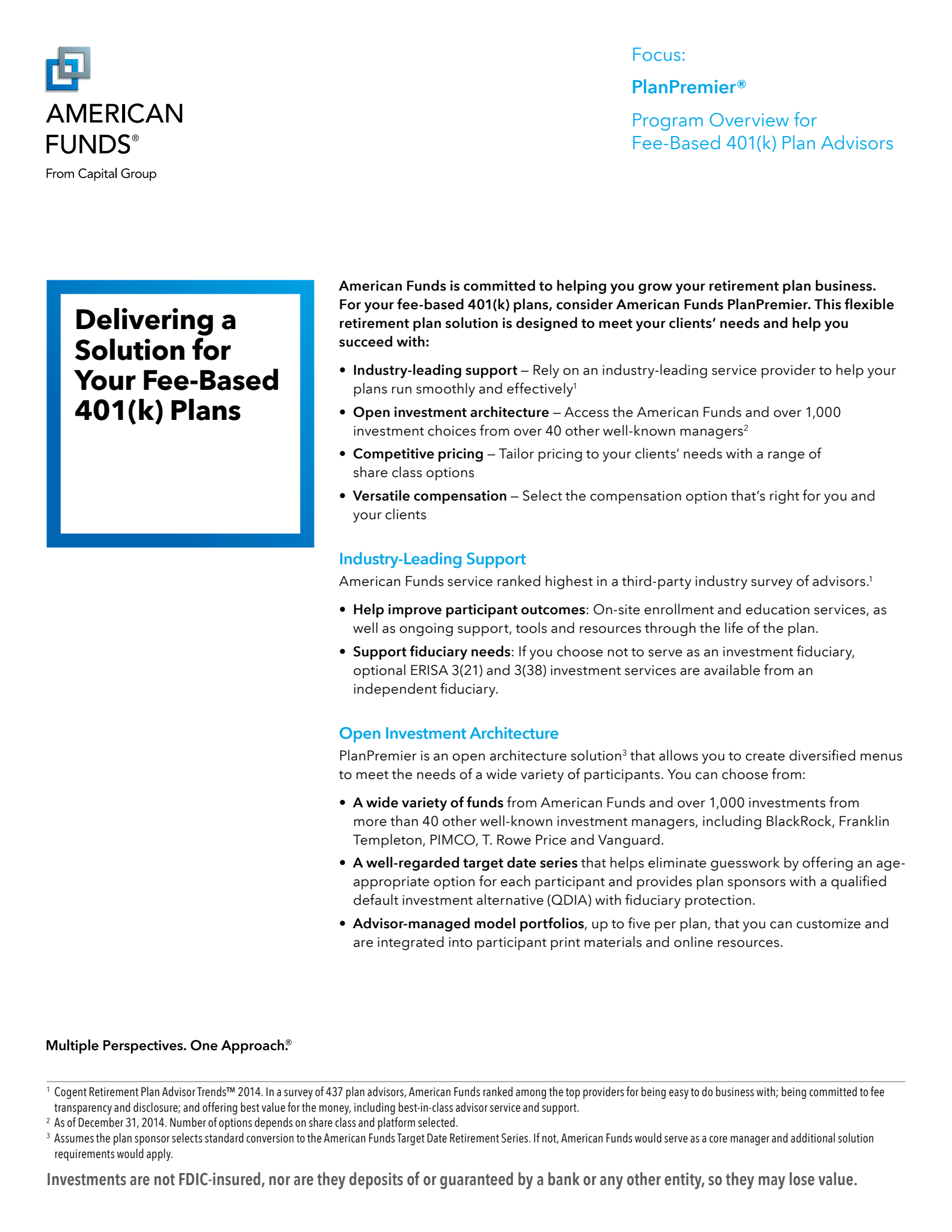
The archive includes publication work for American Funds, presentation systems, data visualization, chart production, modular graphic devices and web-oriented experiments. The examples here show how research and investment information can move between long-form publications, presentation graphics and reusable visual systems without losing clarity.
Presentation design and complex data
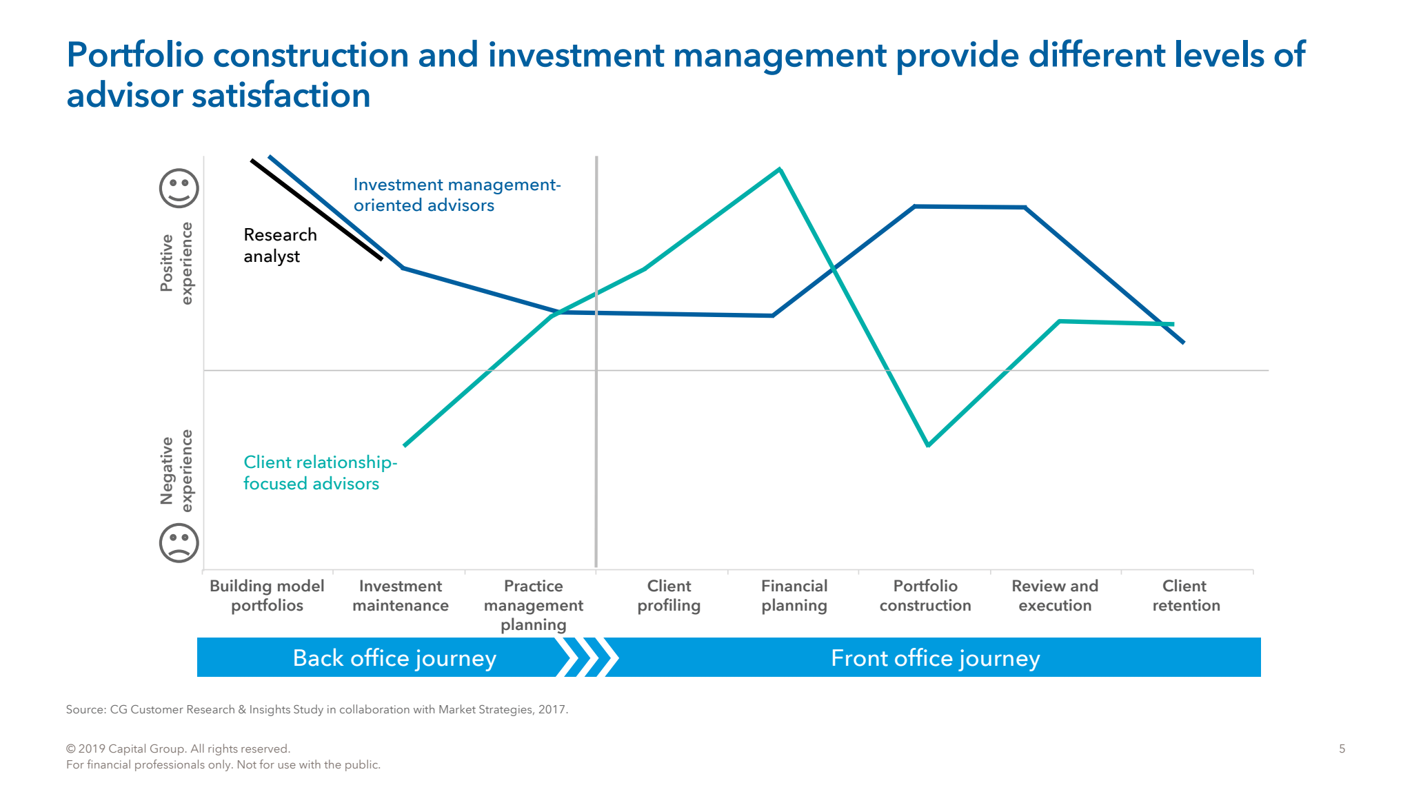
PowerPoint was part of the production system, not an afterthought. These examples show dense investment information structured for presentation: hierarchy, comparison, chart design and reusable visual language built to make complicated financial material easier to scan and discuss.
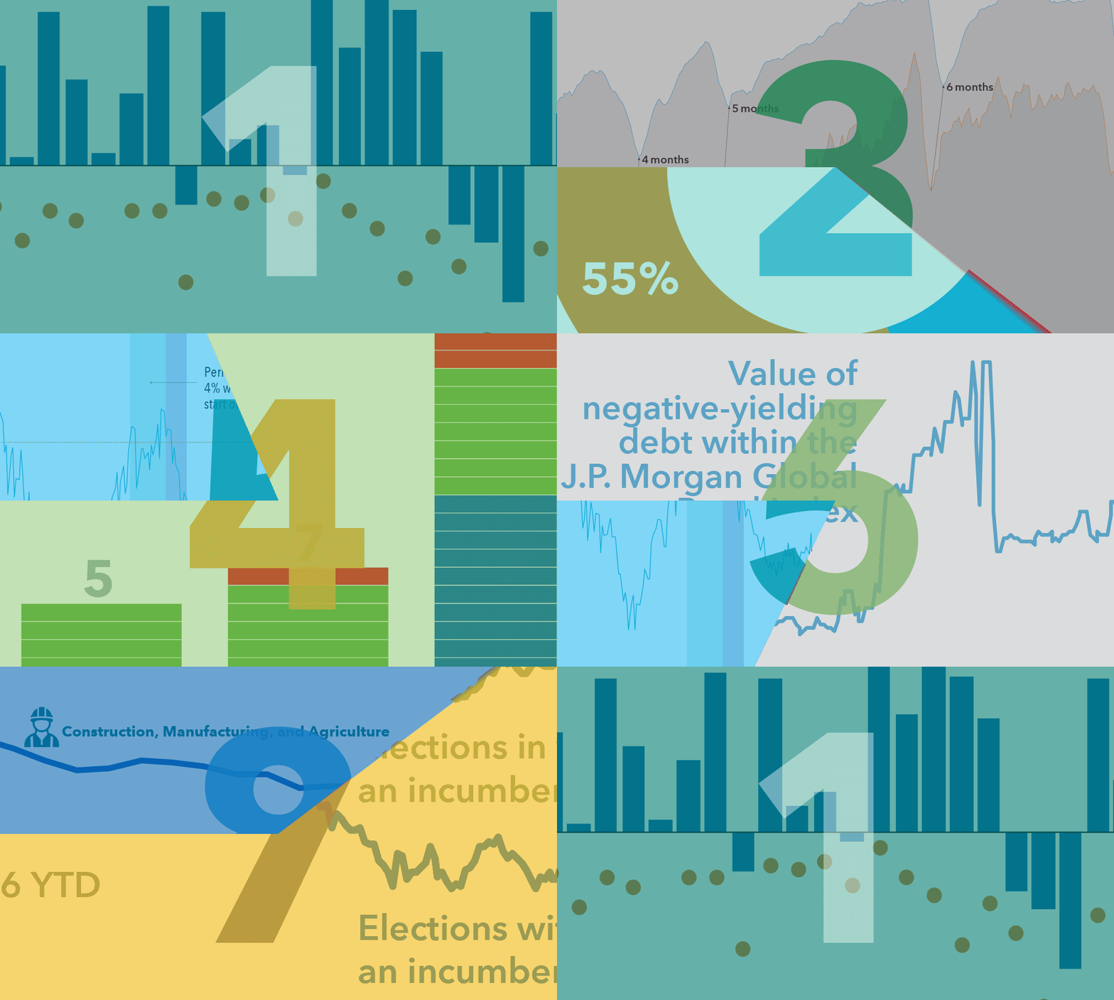
This is the point in my career where information design increasingly became a systems and technology problem: the same underlying content needed to work across different formats, audiences and production methods.
The Work Behind the Story.